

Do-A-Tattoo
(My first app design!)

Overview
Project
CareerFoundry tasked me with illustrating the entire UX Design process by exploring and improving the existing tattoo apps
Role
End-to-end UX Designer
Tools
Pen & paper, sticky-notes, Keynote, Optimal Workshop, Apple Preview, Balsamiq, Adobe XD
Duration
6 months (July 2019-Jan 2020)
Click here to watch a video presentation of Do-A-Tattoo
Objective
With the ever-growing popularity of tattoos, the market is becoming inundated with designs, styles, and artists. Users need an effective way to explore the variety of styles, gather inspiration, and collaborate with the most suitable artist to reduce regret.
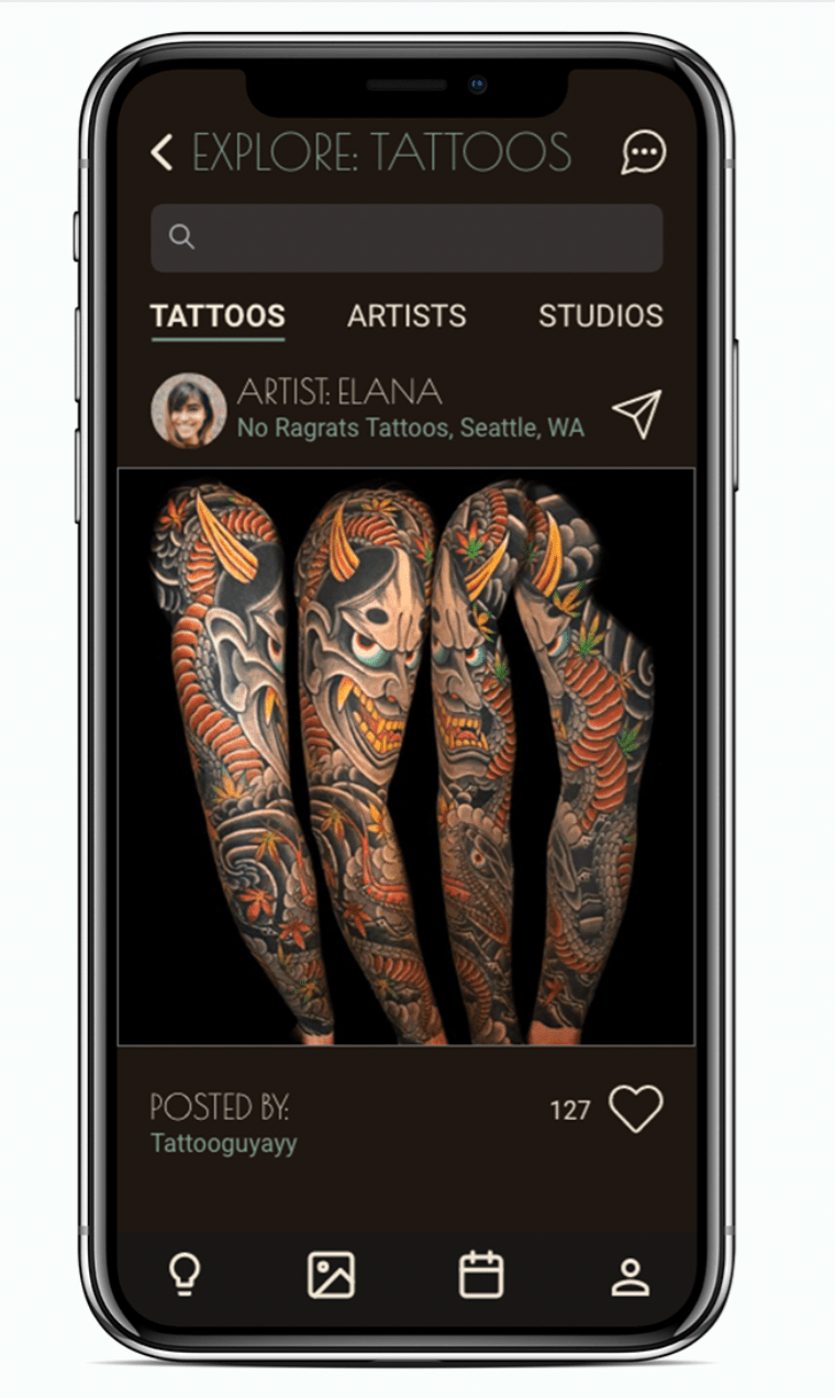
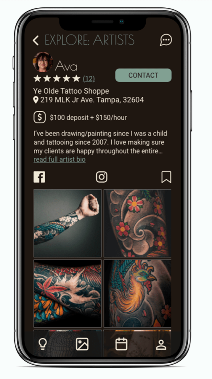
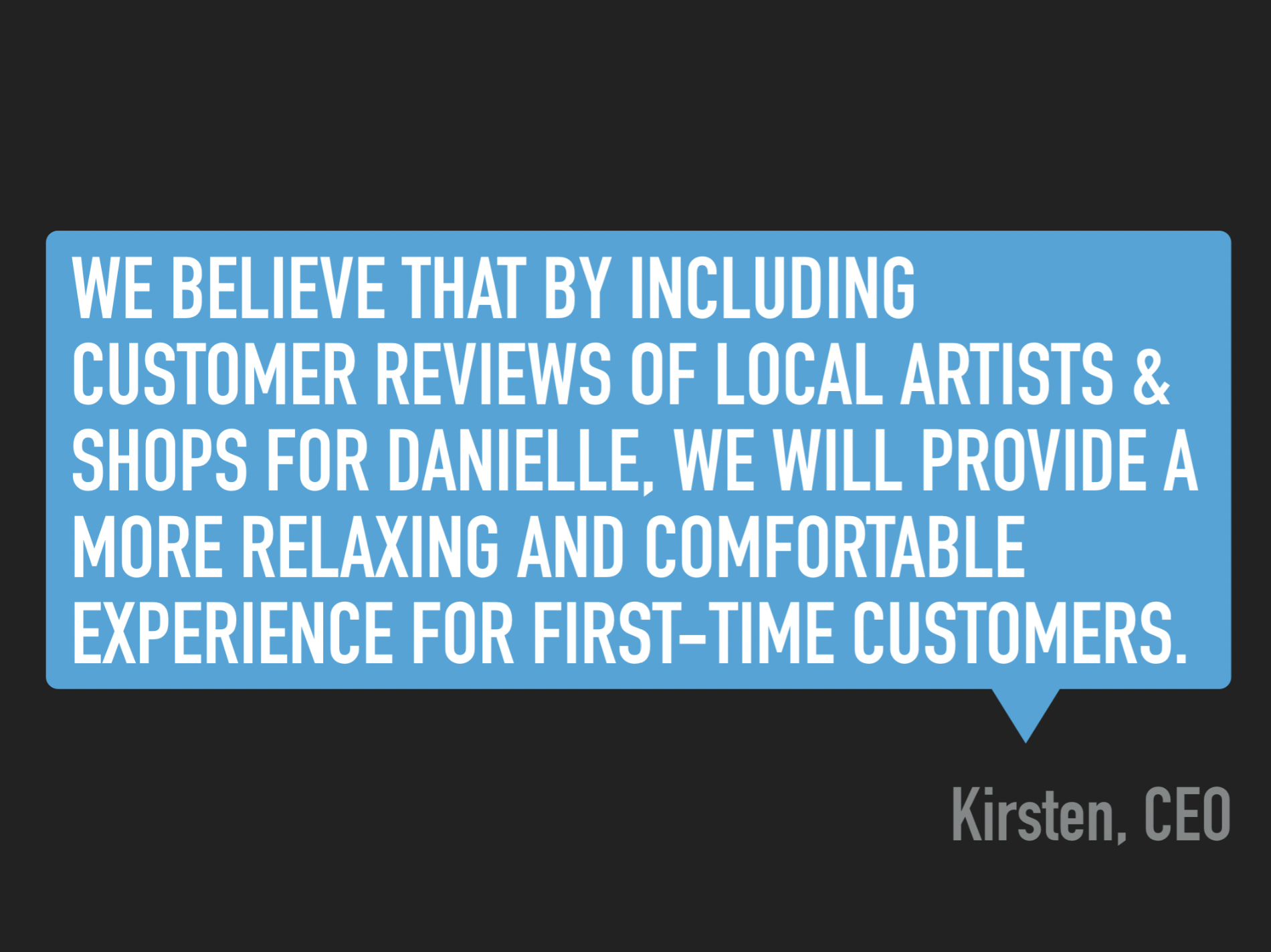
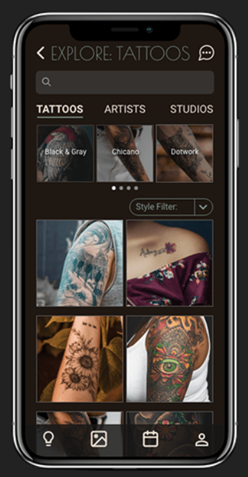
This app provides a space for users to gather inspiration, compile images, and find the best match in a tattoo artist. Users can learn about different styles of tattoos, filter search results by style and/or content, save, organize, and share images, search for artists based on location and style specialization, collaborate with artists and book appointments through the app.

Unlike poor Gob here, we don't want our users experiencing any regret after getting their tattoo.
It began with a competitive analysis, user interviews, and affinity mapping to discover what the goals, needs, and frustrations of users were. From there, I was able to start creating a plan on how to effectively solve their problems and support them along their tattoo journey.
Process
My research goals for this section were to explore the following questions:
- How do you decide on a tattoo design?
- How do you decide on a tattoo artist?
- Is there anything you wished you did differently throughout your tattoo process?
After the user interviews, I jotted down notable quotes and behaviors onto separate sticky notes.
Blue sticky notes = quotes
Orange sticky notes = behaviors
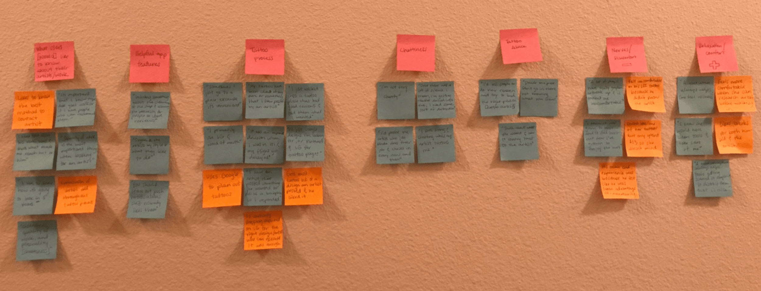
Here is the digitized and more legible version of the above photo:
(Click to enlarge image)


Key Takeaways from User Interviews:
Users want to know how much a tattoo is going to cost beforehand
The easiest way to reduce regret is to know what you want AND how to communicate that to the artist
I realized that if I use different colored sticky-notes for each interviewee, it could help with noticing more patterns and provide more detailed information at-a-glance
The results from the affinity mapping made me realize that users tend to fall under 1 of 2 types;
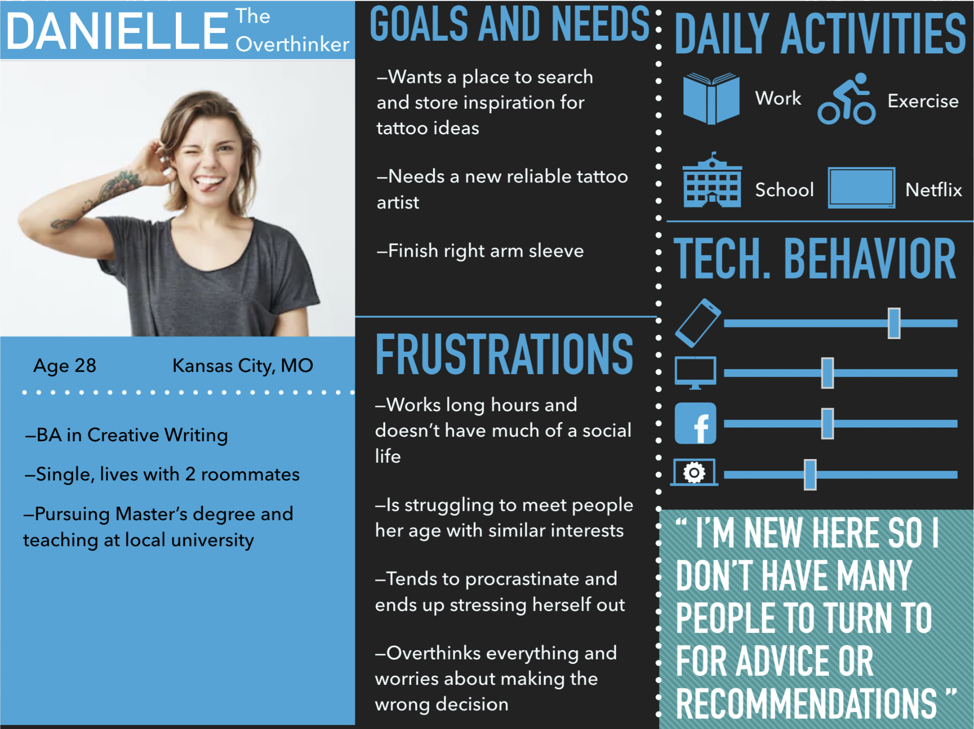
Type 1-The Overthinker: Very cautious, takes a long time to decide on a design, researches and compares artists/shops, etc.
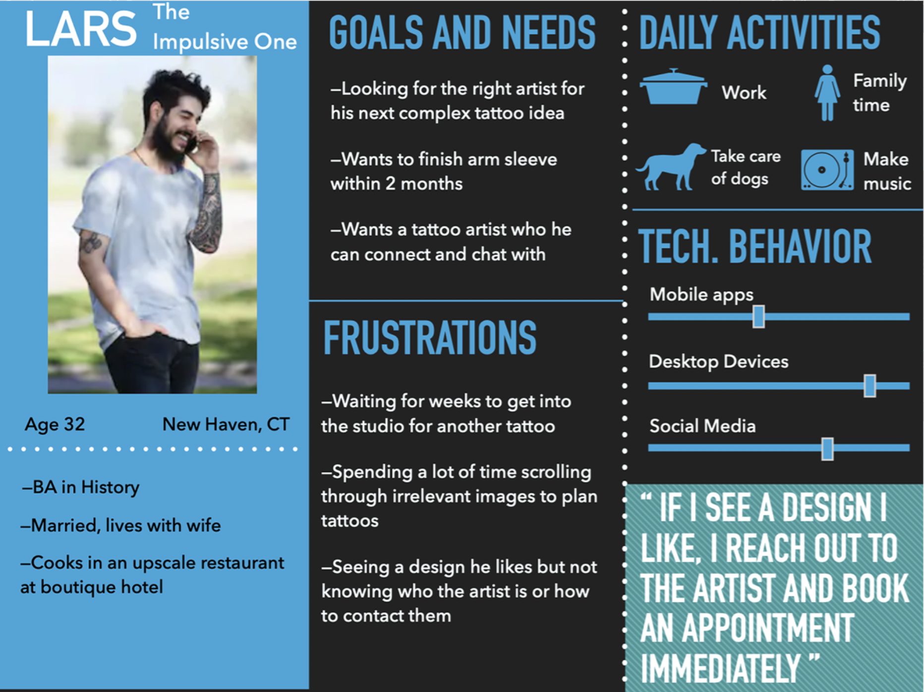
Type 2-The Impulsive One: Has an idea for tattoo, looks for artist nearby, walks into shop, gets tattoo ASAP.
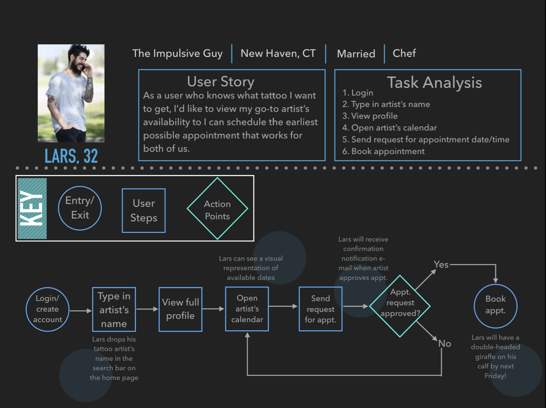
Next I created the following user personas, accompanied by hypothesis statements that propose solutions to their primary problems:
Personas
Type 1: The Overthinker:
Type 2: The Impulsive One:

This information allowed me to pinpoint some of the most important tasks and goals that the users should be able to achieve with Do-A-Tattoo:
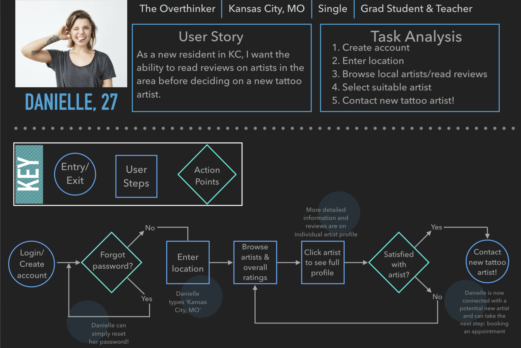
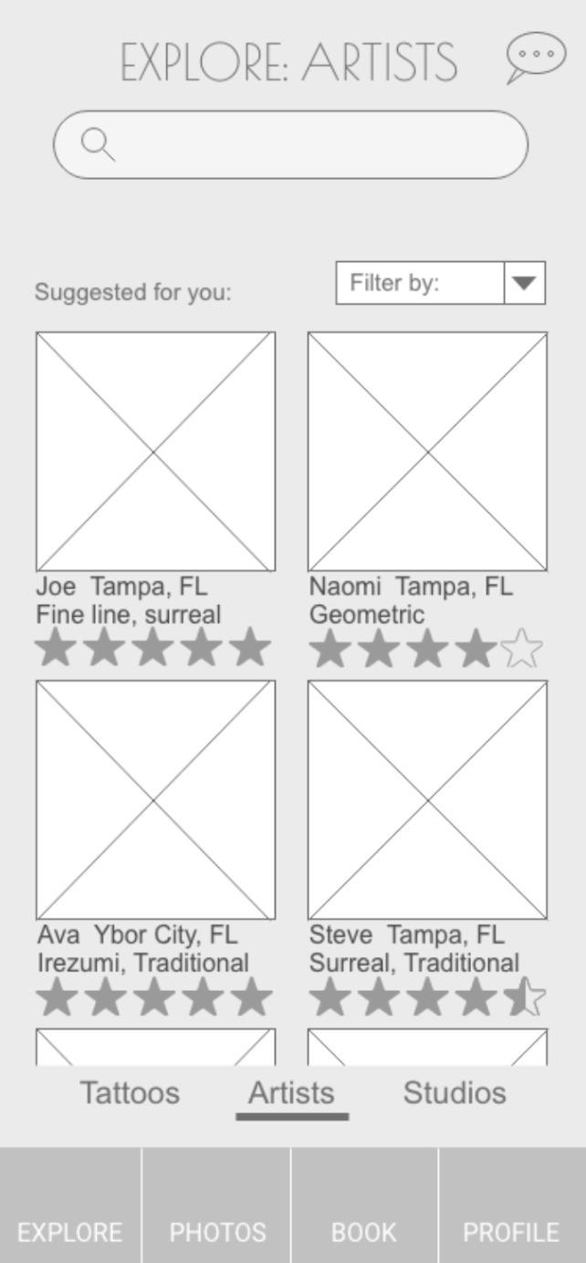
1. Search for artists in a specific area, review profile and portfolio, and read reviews of the artist/studio
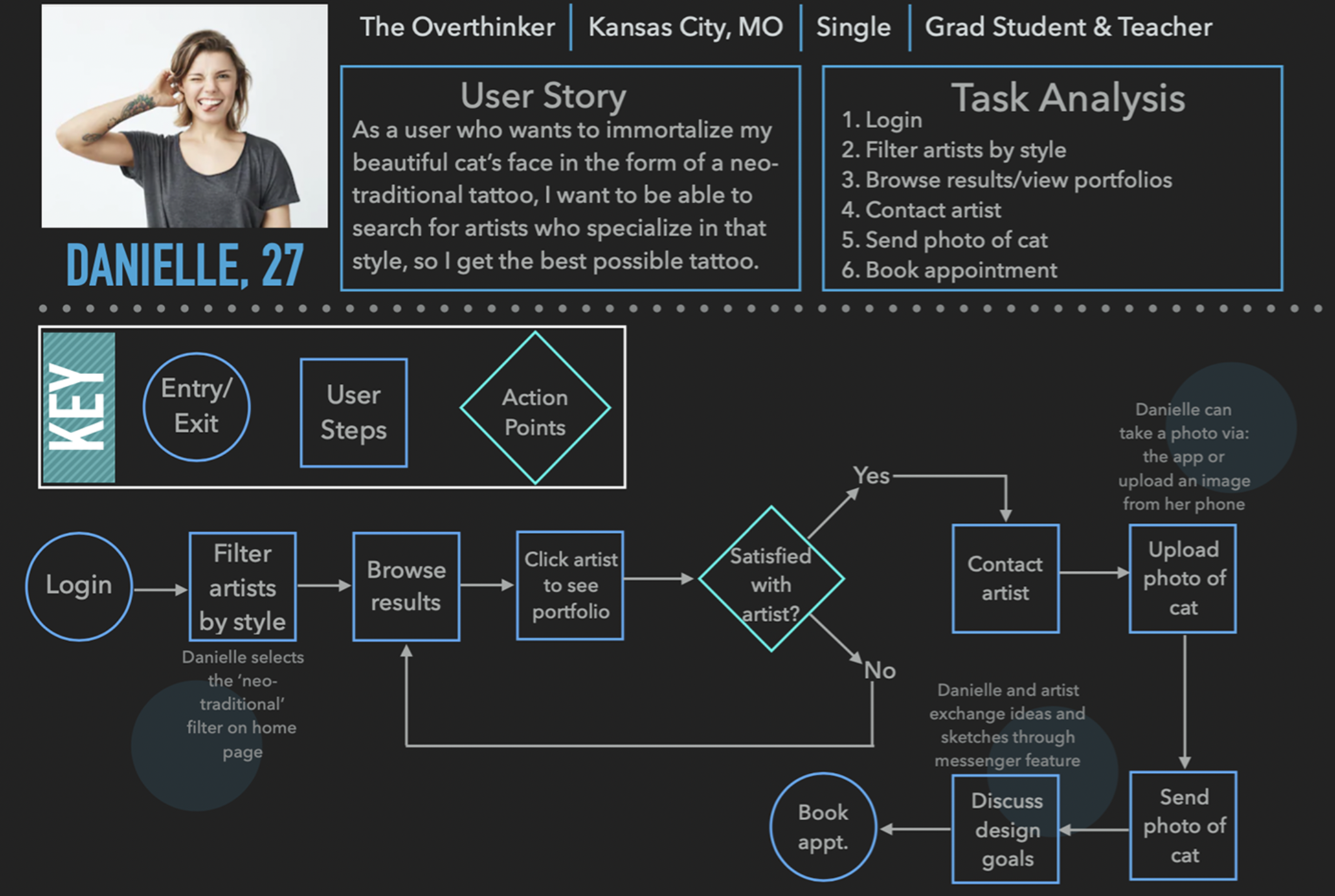
2. Search for a particular artist, collaborate on a design, view their calendar of availability, and book an appointment
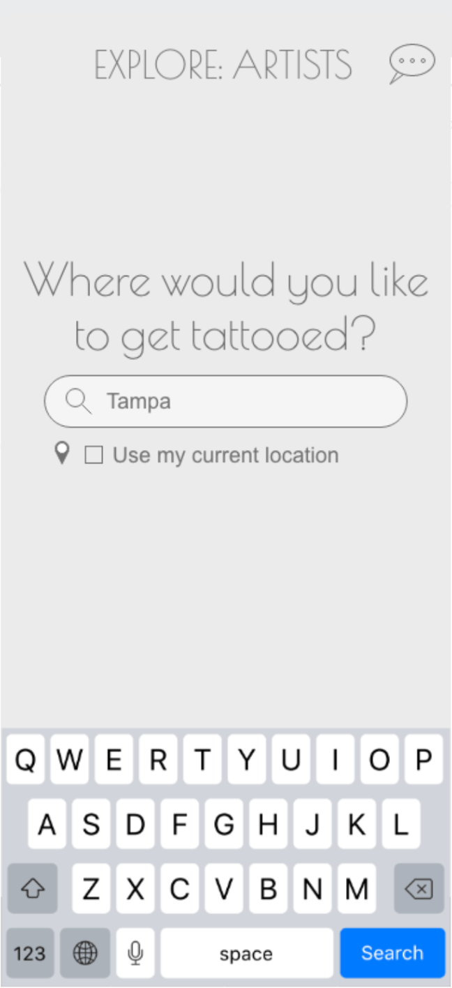
3. Search for both tattoo designs and artists based on specialized style to filter out undesired results for a more streamlined search
Progression of Design
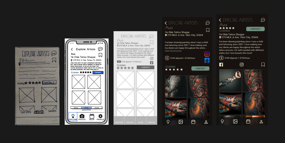
Using pen and paper, I sketched out some low-fidelity wireframes, focusing on the navigational structure of the app. These quick sketches are a fast and inexpensive way to get a lot of ideas out onto paper. Since there is such a low-investment of time, it is easy to quickly reiterate the design until a smooth user experience has been developed.

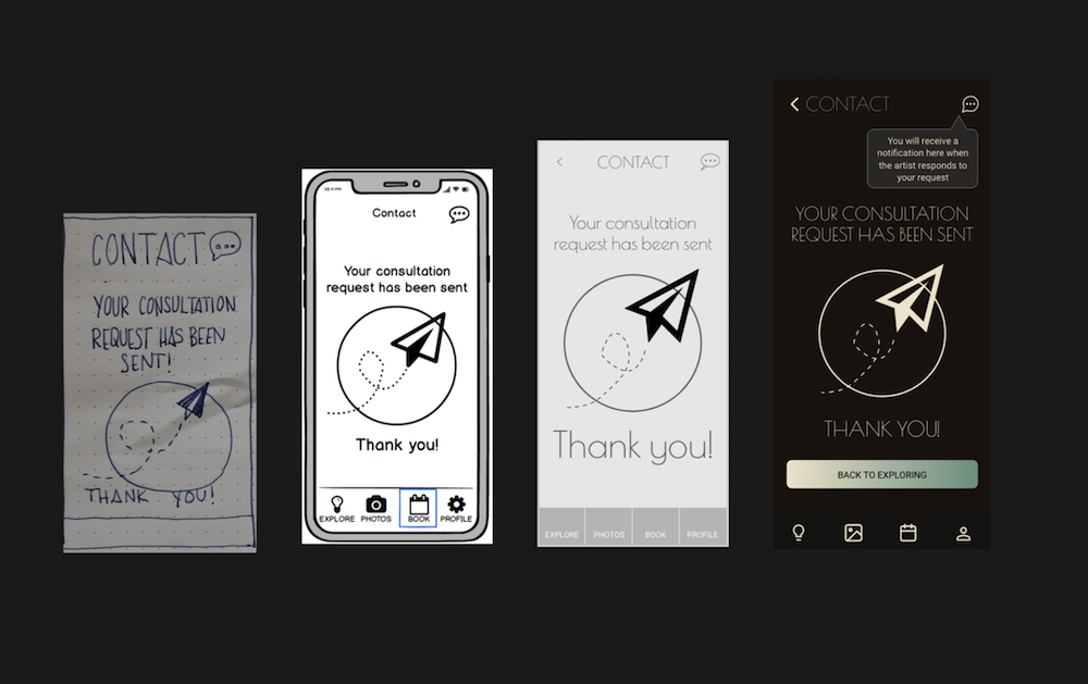
Next, I turned these into a mid-fidelity clickable prototype to begin testing out the design! Below is the same flow that the low-fidelity wireframe illustrated:


Key Takeaways from user testing:
-The most glaring problem was that most users overlooked the 'Request Consultation' button on the Contact page. This was amended in the hi-fidelity prototype by switching the order of the prompts around, putting the 'Request Consultation' button above the question text field.
-Some users thought it was slightly awkward testing out a mobile app on a laptop (for example, some kept trying to type on the keyboard instead of tap on the keyboard displayed in the prototype). Next time, I would like to test out a mobile app on a mobile device to more accurately emulate how the user would experience the app.
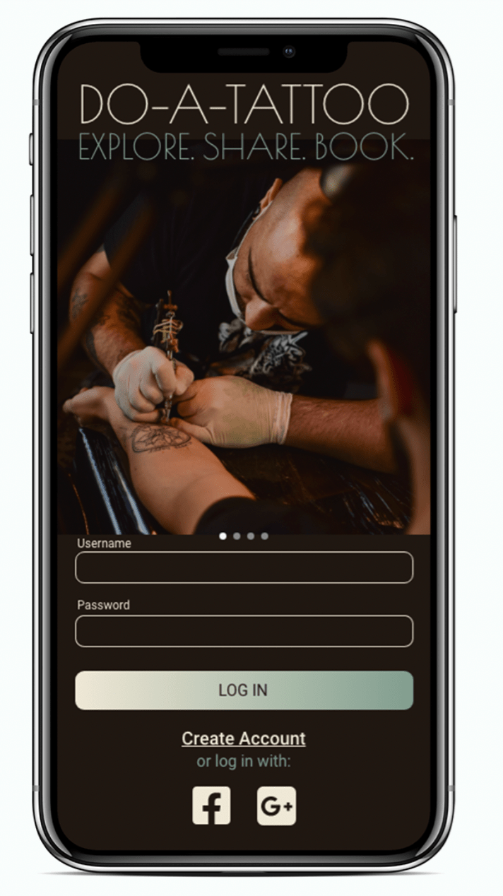
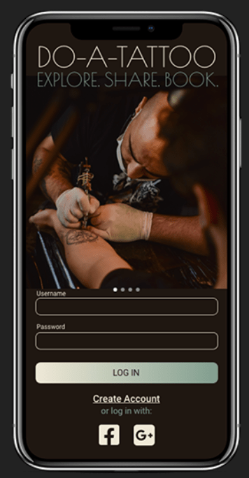
At this point, I had fixed all of the important errors. Moving forward, I began to add color and focus on the UI of my app. To help figure out which direction I wanted to go with the style, I conducted a preference test with the login screen: 'Which design do you prefer and why?'
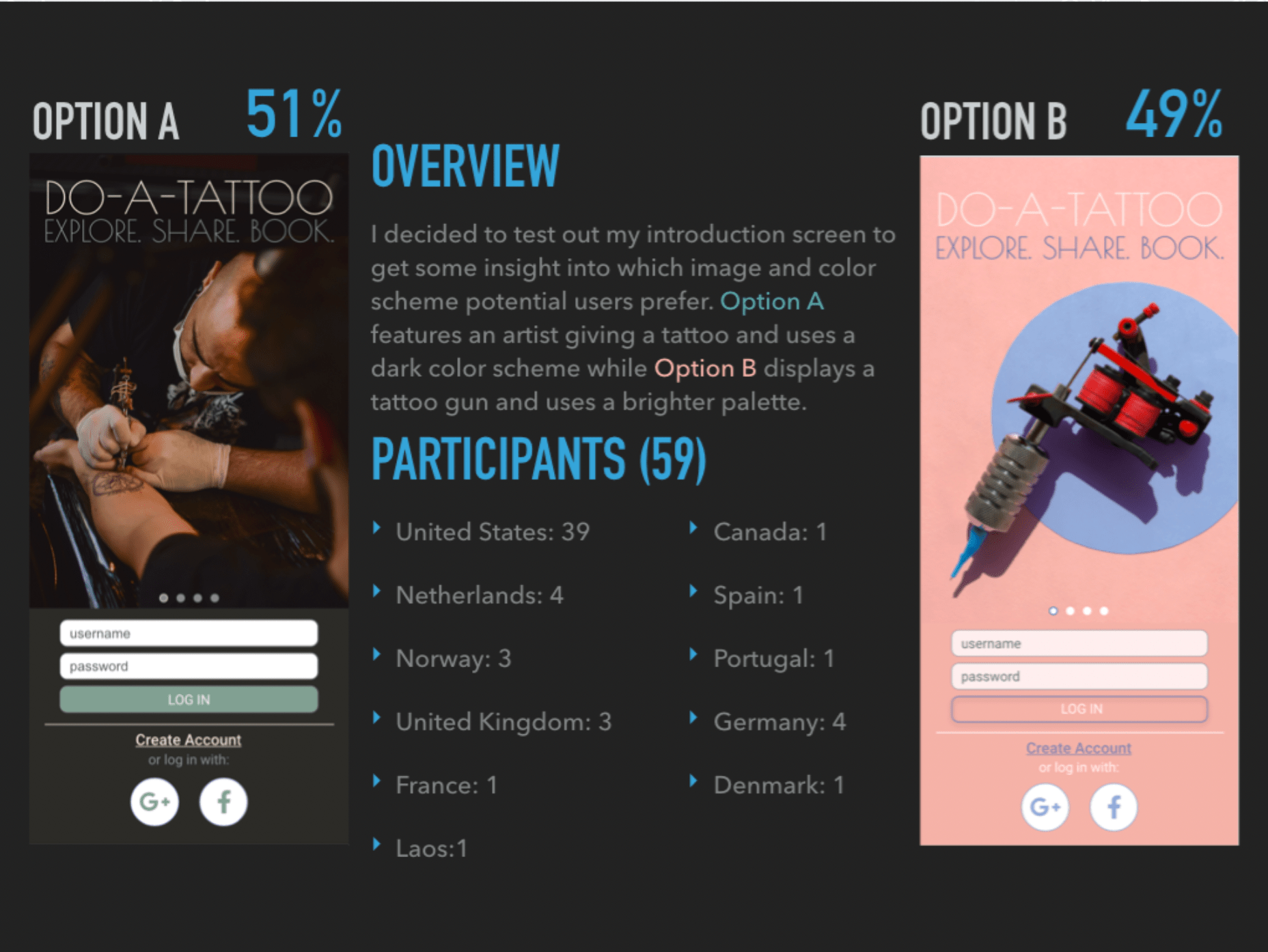
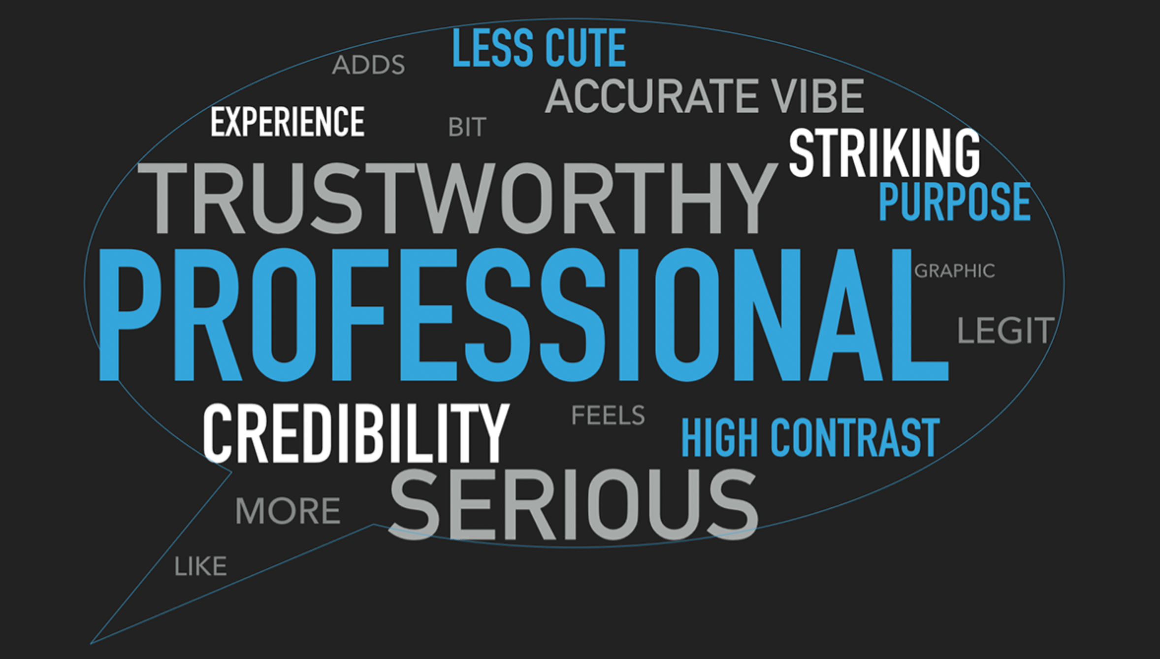
Since the results were not statistically significant at nearly 50/50, I went with Option A. The buzzwords for Option B were ‘bright,’ ‘simple,’ and ‘unique,’ while Option A was described as, ‘professional,’ ‘trustworthy,’ and ‘serious’. Because getting a tattoo is a big decision not to be taken lightly, I think going with an intro screen with words to reflect those values is the best decision, as Option A invoked in participants.
Here are a few examples of the iterations my app has undergone:
To begin finalizing my iterations, I learned more about web accessibility and made sure to check all of my color contrasts against the WCAG (World Content Accessibility Guidelines) and ensured that my text fields are all properly labeled. Additionally, my screens are web-reader friendly now!
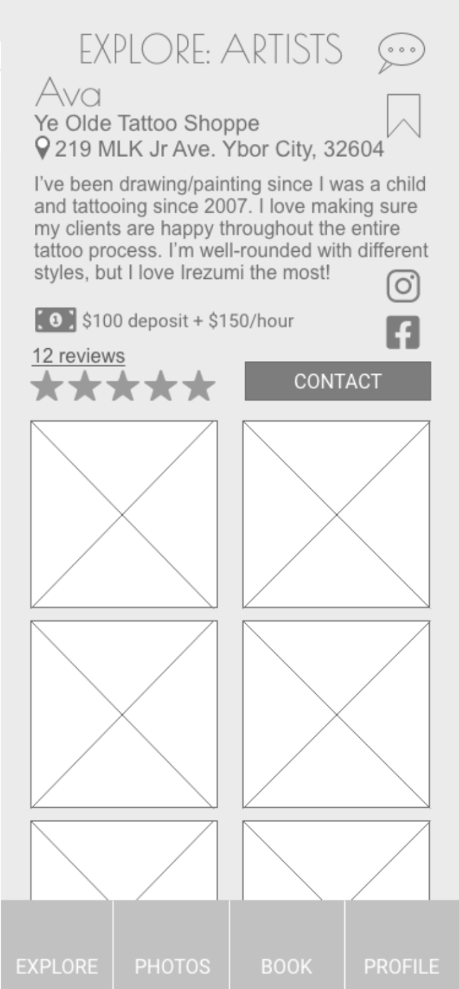
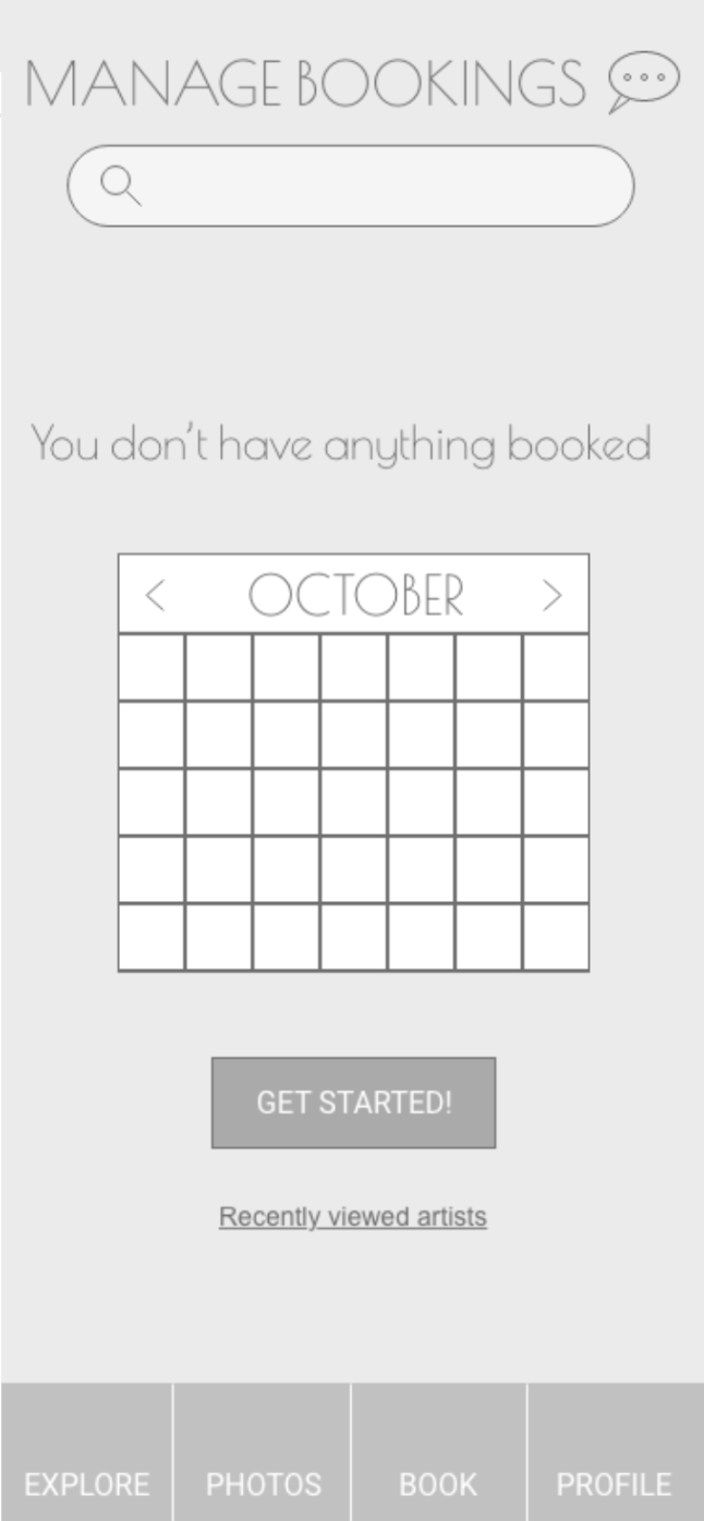
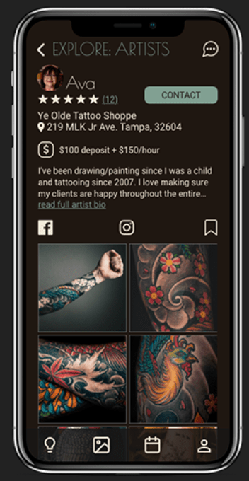
Final Mockups
After polishing the design one last time, I am very proud to present the final mockups of my first app:


Overall Takeaways:
-Save every iteration along the way to track progression and save files under a name that reflects the version/changes. In hindsight, this is a no-brainer. But as a new designer, I would get too excited about seeing my progress and save over my older designs, resulting in a few gaps throughout the design process.
-Components, components, components. Practically everything should be a component. I need to ensure that I make copies from master components to save time when editing and making minor adjustments. It will also ensure consistency in the design.
-The insight that I gathered from user-testing is invaluable. The sooner, the better! It is one of the most helpful and eye-opening experiences for a designer. It can help save a lot of time by shedding light on problems that are easily fixed early on in the design process.